Welcome to Web Type,
scrolling down for web typography tips
and
Contrast
Low Contrast
Legibility suffers.
When the contrast is too low, users experience eye strain as they try to decipher the words. Research has also shown that people are less trusting of text that is hard to read
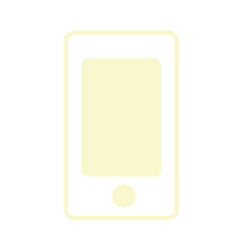
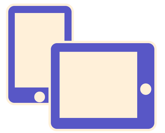
Mobile use becomes difficult
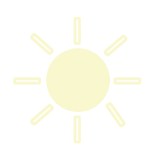
Imagine trying to read low-contrast text on a mobile device while walking in bright sun. Even high-contrast text is hard to read when there is glare, but low-contrast text is nearly impossible.
Low Contrast
Hight Contrast
Check for accessibility-compliant color combinations. Checking those combinations paired with your font size, as some combinations become compliant when the font is large enough.
Adjust font size. When users scan text on a webpage, larger text gets read first. Use at least an 14-pt font.
High Contrast
Elderly users
with bad vision
Low quality
monitors
Bad lighting
and glare
Reading on
tiny screens
Weight
100 Extra Light or Ultra Light
200 Light or Thin
300 Book or Demi
400 Normal or Regular
500 Medium
600 Semibold, Demibold
700 Bold
800 Black, Extra Bold or Heavy
900 Extra Black, Fat, Poster or Ultra Black
One of the challenges with web fonts is that most web browsers do not properly support font weights other than normal & bold.
You can create a font-family definition for Interstate-Light, and then use the ‘font-weight:normal’ definition
{ font-family: "Interstate Light"; font-weight: normal; }
{ font-family: "Interstate Medium"; font-weight: normal; }
{ font-family: "Interstate Regular"; font-weight: normal; }
Sizes
Web
12pt
The bigger the screen solution, the bigger the font size.
A general size:
12pt - 14pt
A general size is
8pt - 12pt
Length
Big Devices
Ideal line is
45 - 55 characters*
Small Devices
Ideal line is
25 characters*
Effects
Letterpress
To create the letterpress effect,
we need to add a shadow that’s lighter than
the colour of the text to ensure the effect works correctly.
Tutorial here.
Embossing
To create the empossing effect,
we need to add two diagonally offset shadows.
White shawdow to the top left, and black shadow to the bottom right
Tutorial here.
Anaglyphic
Anaglyphs are those amazing 3D images that are created by
offsetting two of the red, green and blue channels,
and are viewed with those nerdy looking 3D glasses with different coloured lenses.
Tutorial here.
3D Text
3D text can be created by bold text and a series of descending shadows,
each has no blur and is an increasingly darker shade of grey.
The eighth shadow is dark-blue and blurred to enhance the overall effect.
Tutorial here.
Times New Roman
“As a new face it should, by the grace of God and the art of man, have been broad and open, generous and ample; instead, by the vice of Mammon and the misery of the machine, it is bigoted and narrow, mean and puritan.”(In A Tally of Types, Morison good-naturedly imagined what William Morris might have said about it)
1931
Year
Stanley Morison
Victor Lardent
Designer
Sorkin Type Co
Foundry
Merriweather
Merriweather was designed to be a text face that is pleasant to read on screens. It features a very large x height, slightly condensed letterforms, a mild diagonal stress, sturdy serifs and open forms.
2010
Year
Eben Sorkin
Designer
Sorkin Type Co
Foundry
Palatino
Zapf named the font after Giambattista Palatino, a master of scripts from the time of Leonardo da Vinci
1948
Year
Hermann Zapf
Designer
Mergenthaler
Linotype
Foundry
Courier New
12-point Courier New was also the U.S. State Department's standard typeface until January 2004, when it was replaced with 14-point Times New Roman.
1955
Year
Adrian Frutiger &
Howard "Bud" Kettler
Designer
N/a
Foundry
Cormorant Garamond
Cormorant is an original design for an extravagant display serif typeface inspired by the Garamond heritage, hand-drawn
2011
Year
Christian Thalmann
Designer
Catharsis
Foundry
Playfair
It became to print letterforms of high contrast and delicate hairlines that were increasingly detached from the written letterforms.
2013
Year
Claus Eggers
Sørensen
Designer
Claus Eggers
Sørensen
Foundry
Arial
It was created to be metrically identical to the popular typeface Helvetica, so that a document designed in Helvetica could be displayed and printed correctly without having to pay for a Helvetica license.
1982
Year
Robin Nicholas
Patricia Saunders
Designer
Monotype
Foundry
Georgia
The typeface's name referred to a tabloid headline claiming "Alien heads found in Georgia."[2]
1996
Year
Matthew Carter
Designer
Microsoft
Corporation
Foundry
Raleway
At first glance, Raleway might appear similar to a font like Gotham, however, it contains distinctive characters such as a criss-crossed w and an l with a tail.
2012
Year
Multi-Designers
Designer
The League of
Moveable Type
Foundry
Tangerine
Tangerine is a calligraphic typeface, which is great for titles or short texts at large sizes
2010
Year
Toshi Omagari
Designer
Toshi Omagari
Foundry
Lora
The overall typographic voice of Lora perfectly conveys the mood of a modern-day story, or an art essay.
2011
Year
Multi Designers
Designer
Cyreal
Foundry
Arvo
In the Finnish language, Arvo means “number, value, worth.” Considering how much programming is behind hinting, ‘number’ is also true.
2010
Year
Anton Koovit
Designer
Google
Foundry
Lato
“Lato” means “Summer” in Polish The semi-rounded details of the letters give Lato a feeling of warmth, while the strong structure provides stability and seriousness. “Male and female, serious but friendly. With the feeling of the Summer,” says Łukasz.
2010
Year
Łukasz Dziedzic
Designer
tyPoland
Foundry
Alegreya
Alegreya is a great serif font to substitute for any default serif web font.. Alegreya was chosen as one of 53 “Fonts of the Decade” at the ATypI Letter2 competition in September 2011, and one of the top 14 text type systems.
2010
Year
Mitja Miklavčič.
Designer
Fontfont
Foundry
Open-Sans
According to Google, it was developed with an "upright stress, open forms and a neutral, yet friendly appearance" and is "optimized for legibility across print, web, and mobile interfaces."
2011
Year
Steve Matteson
Designer
Ascender
Corporation
Foundry
Dosis
Dosis is a very simple, rounded, sans serif family. The lighter weights are minimalist. The bolder weights have more personality. The medium weight is nice and balanced.
2012
Year
Edgar Tolentino
Pablo Impallari.
Designer
Impallari Type
Foundry