Overview
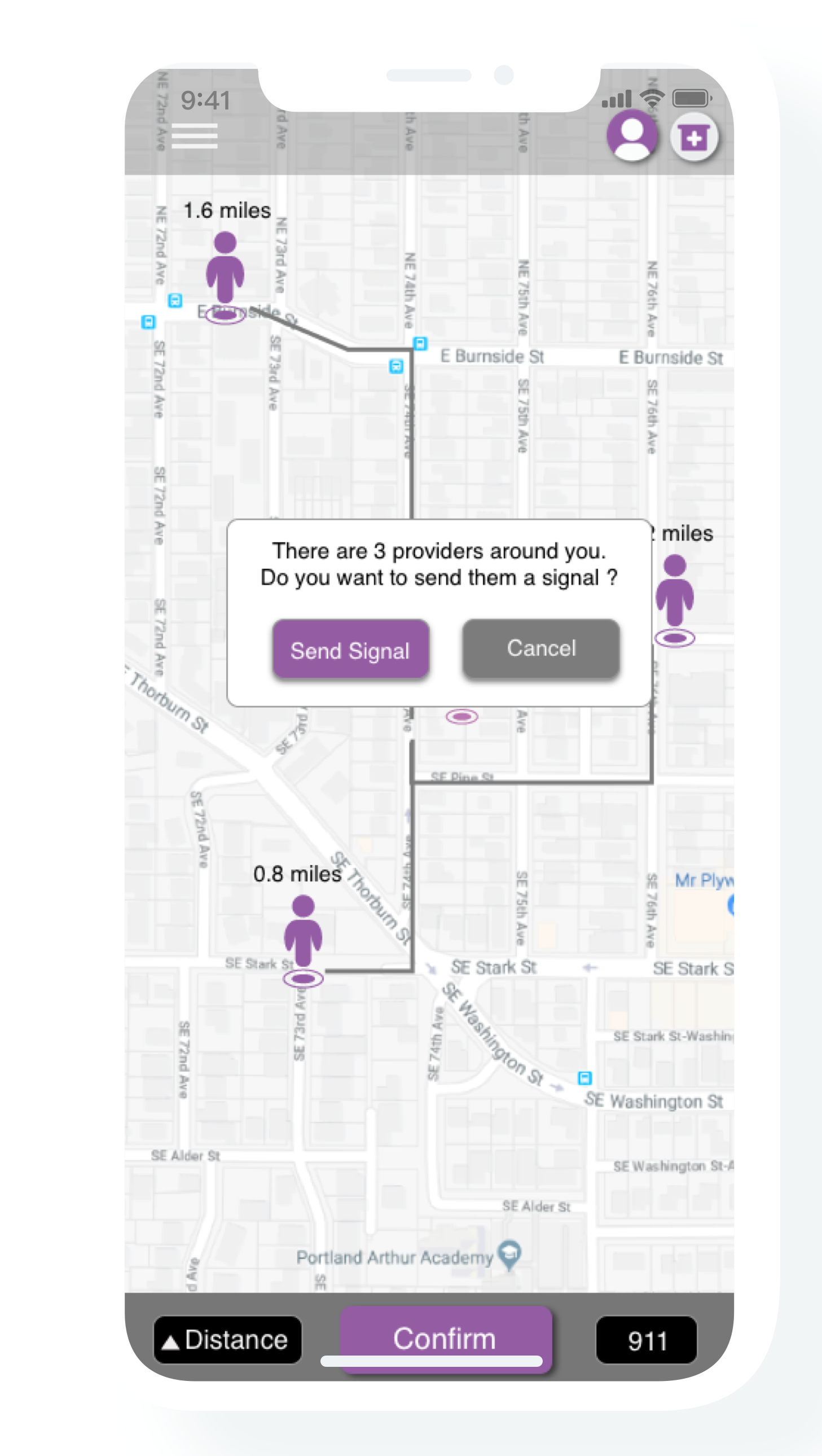
Izzy is an “lifesaving” app I designed that would connect people who had overdosed with other people who carry naloxone, a common treatment used for overdosing. The app’s intent was that it could be downloaded by anyone and launched at a moment’s notice if the user came across an ailing drug user who desperately needed help.
Izzy would locate other users in the area who have indicated that they are carrying naloxone and would call them to help save the overdosing person’s life. The app also was designed to help users find naloxone from local pharmacies in case there were no users nearby with naloxone.
My Tasks
Branding, Logo Design, User Flows, User Interface, Prototype
My Roles
UX Researcher
UI Designer
Graphic Designer
Research indicates that approximately 43,982 people die each year from drug overdoses in the United States, with an average of about 120 deaths per day. To help prevent unnecessary deaths, Izzy strived to connect overdosing persons to others in the area who carried naloxone.
Izzy’s intent was to make saving lives as easy as possible. Ordinary persons could easily become heroes if noticed overdosed drug users, and use the Izzy app to summon naloxone providers and bring lifesaving treatment in time.

Connecting an overdosed person
with persons who carry naloxone

Estimated arrival times
from a provider to the patient

Finding naloxone
from nearby stores
Izzy’s story
The app’s name, ‘Izzy,’ comes from the tragic story of Isobel Jones-Reilly. At just 15 years old, Izzy died from from an overdose after taking ecstasy that she found in a university lecturer’s drug stash. “She started to get really hot and sweaty and went upstairs to lie down. We asked, ‘should we call an ambulance?’, but Izzy said no.” To many people in Isobel’s situation, calling 911 seems to bring a lot of anxiety, especially for teens who cannot afford a medical bill. However, Izzy’s life could have been saved if she was rescued in time.

Define the brand
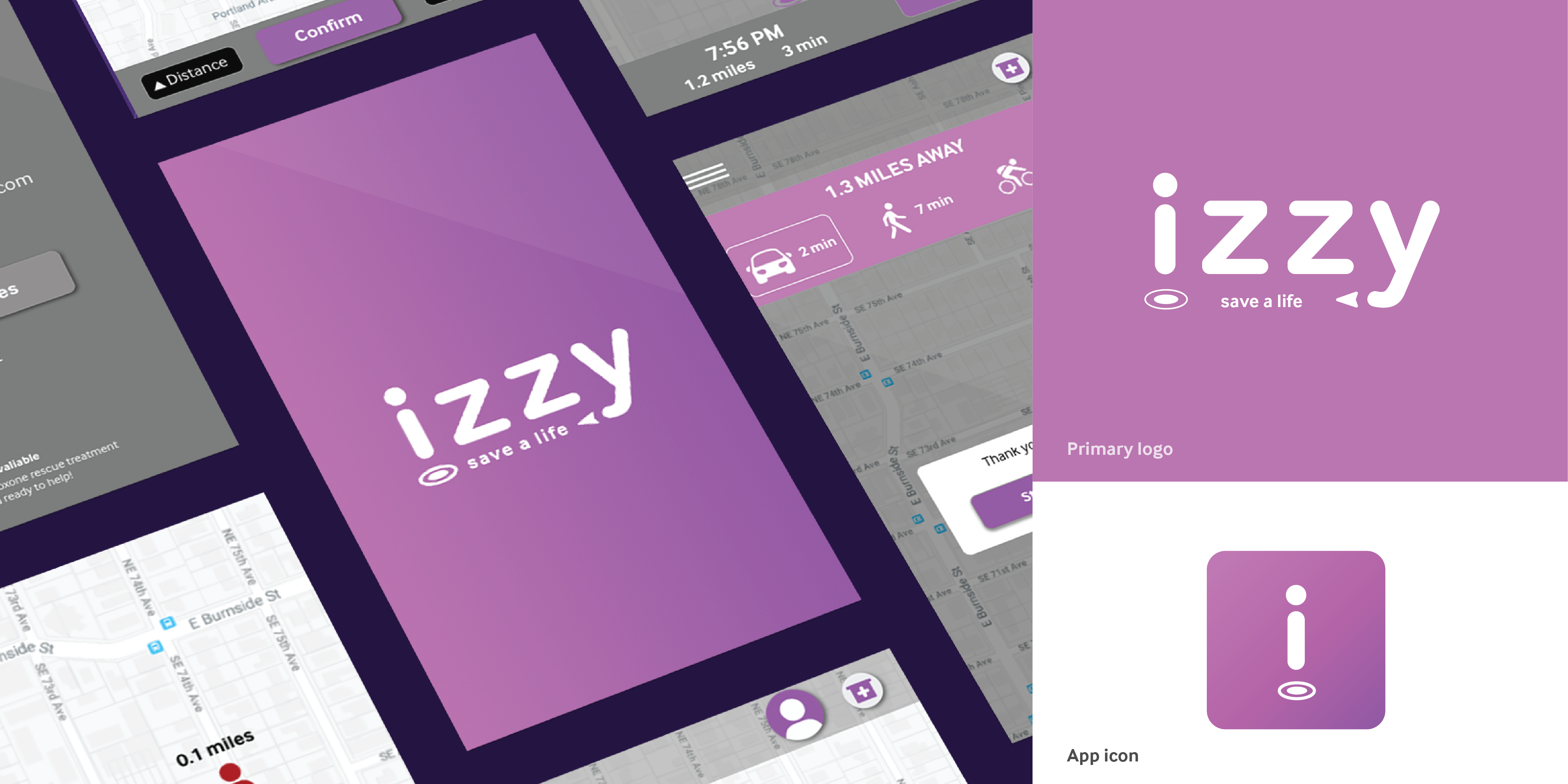
Users would open Izzy if they became concerned that a person was dying from an overdose and needed help immediately. In this kind of emergency situation, the user would need to stay calm, and therefore the app utilized gentle shades of lavender as a reassuring primary color. It was crucial that the information on Izzy’s user interface be straightforward and clearly legible as possible. Therefore, InterFace served as the primary typeface to best serve the user’s needs in an emergency.


